Portals and dashboards: managing density without losing orientation
A method for organising large amounts of information through hierarchy, views, states and progressive detail without creating a wall of data.
Published · 5 September 2026Updated · 5 September 2026
00 · Premise
Density and clarity are not opposites.
A professional dashboard can show a lot if every piece of information has a role and priority. The problem begins when everything competes at the same level: people see more data but understand less about what needs attention.
Two kinds of orientation
Overview and detail should reinforce each other.
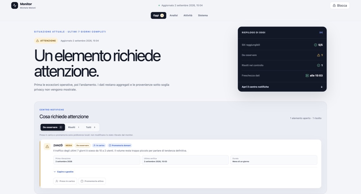
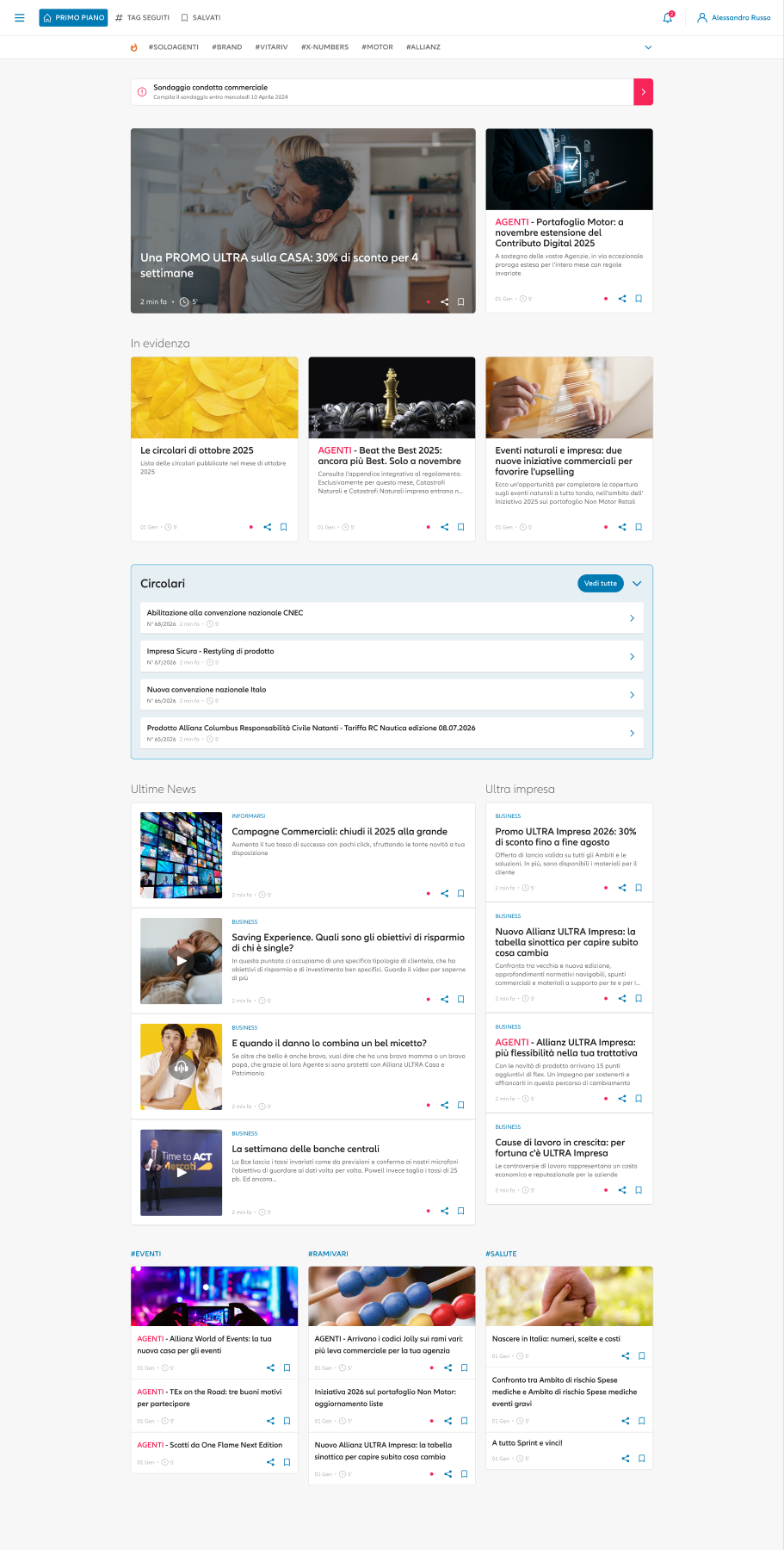
The site monitor prioritises comparison and overall status; the X-News portal organises content, updates and operational access. In both, hierarchy must show where we are and what deserves the next level of attention.
Clarify the questions the view answers
Each screen should answer a few recurring questions: what happened, what needs attention and where to investigate. Data that does not support one of these questions can live elsewhere.
Practical actions
- List the decisions made with the dashboard.
- Separate monitoring, analysis and configuration.
- Keep only actionable indicators in the overview.
Build levels of reading
Headings, summaries, comparisons and details should form a visual path. Colour and size are not enough; position, grouping and stable semantics matter.
Practical actions
- Use a consistent hierarchy for page, section and data.
- Group elements that change together.
- Reserve alert colour for states that require action.
Keep context and state visible
Filters, time ranges, selections and freshness affect interpretation. When context disappears, even correct data can support the wrong decision.
Practical actions
- Show active filters and the reference period.
- Separate zero, missing data and error.
- Preserve context when opening detail.
Design the path to action
A useful dashboard does more than describe. It connects anomalies and opportunities to detail, ownership or the next step without multiplying equivalent buttons.
Practical actions
- Give every critical state a useful destination.
- Use contextual actions with specific names.
- Confirm changes and refreshes without losing the view.
Ready to use
Portal and dashboard preflight
- The view answers defined operational questions.
- Overview and detail have distinct roles.
- Filters, period and data state are visible.
- Hierarchy and colour guide without noise.
- Zero, missing data and error are not confused.
- Every priority leads to detail or action.
Key principle
Density works when each level prepares the next.
A good dashboard does not necessarily reduce data. It reduces competition between data and makes the move from overview to decision feel natural.