How to simplify a complex digital service
A practical method for reducing cognitive load without hiding rules, exceptions or process responsibilities.
Published · 4 September 2026Updated · 4 September 2026
00 · Premise
Complexity is not removed. It is put in order.
Insurance portals, banking services and internal tools become difficult when they mirror the organisation that created them rather than the task people need to complete. Simplification therefore starts with decisions, not graphics: what someone must understand, which choice they must make and what certainty they need before moving on.
From real project work
The sequence of decisions comes before the layout.
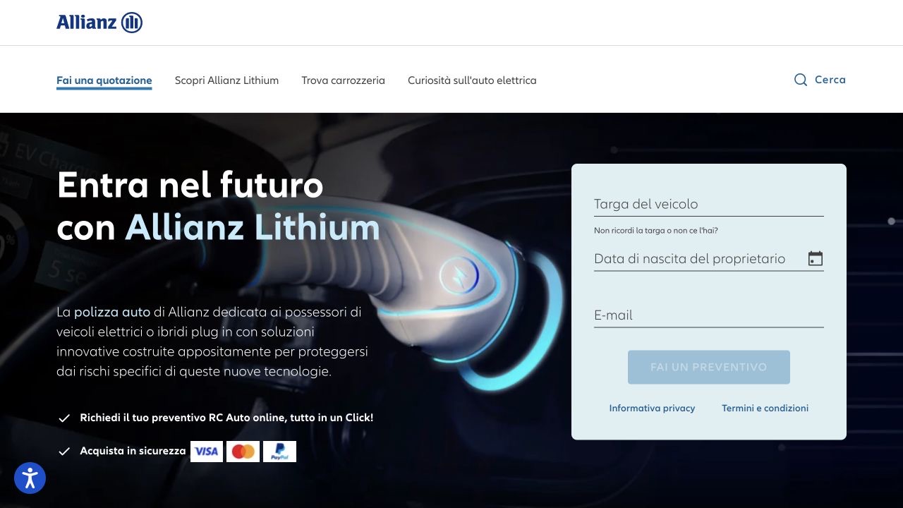
In work on Allianz products and services, clarity could not rely on visual polish alone. The starting point was making priorities, steps and consequences recognisable, so the interface supported the task instead of adding another layer of complexity.
Map decisions and dependencies
Before screens, reconstruct the journey as a sequence of questions. If an answer changes pricing, documents or later steps, that dependency belongs in the flow.
Practical actions
- List the goal, input and outcome of each stage.
- Separate user choices from system checks.
- Map exceptions and returns outside the primary path first.
Reveal information progressively
Showing everything is not the same as being transparent. The right detail should appear when it is useful and remain easy to retrieve.
Practical actions
- Bring decision-critical information to the first level.
- Use disclosure for constraints, definitions and exceptions.
- Keep the choice summary and its consequences visible.
Design states, errors and recovery
Real journeys include waiting, missing data, errors and interrupted tasks. Design these states with the ideal flow and explain what happened and how to continue.
Practical actions
- Separate user, system and temporary availability errors.
- Preserve completed work whenever possible.
- Always provide a concrete next action.
Test realistic tasks
A clean interface can still be difficult. Test complete scenarios with plausible data, observing hesitation, backtracking and requests for help as well as completion.
Practical actions
- Include at least one condition or exception.
- Observe where people look for reassurance.
- Fix the mental model before microcopy and layout.
Ready to use
Quick pre-delivery check
- Every screen has one recognisable primary decision.
- Requested information is explained or contextualised.
- Summary, status and next step are explicit.
- Errors and edge cases allow recovery.
- The flow has been tested with realistic content and constraints.
Key principle
Simplification makes complexity manageable.
The outcome is not necessarily a shorter path, but an experience in which people know where they are, why they are doing something and what will happen next.